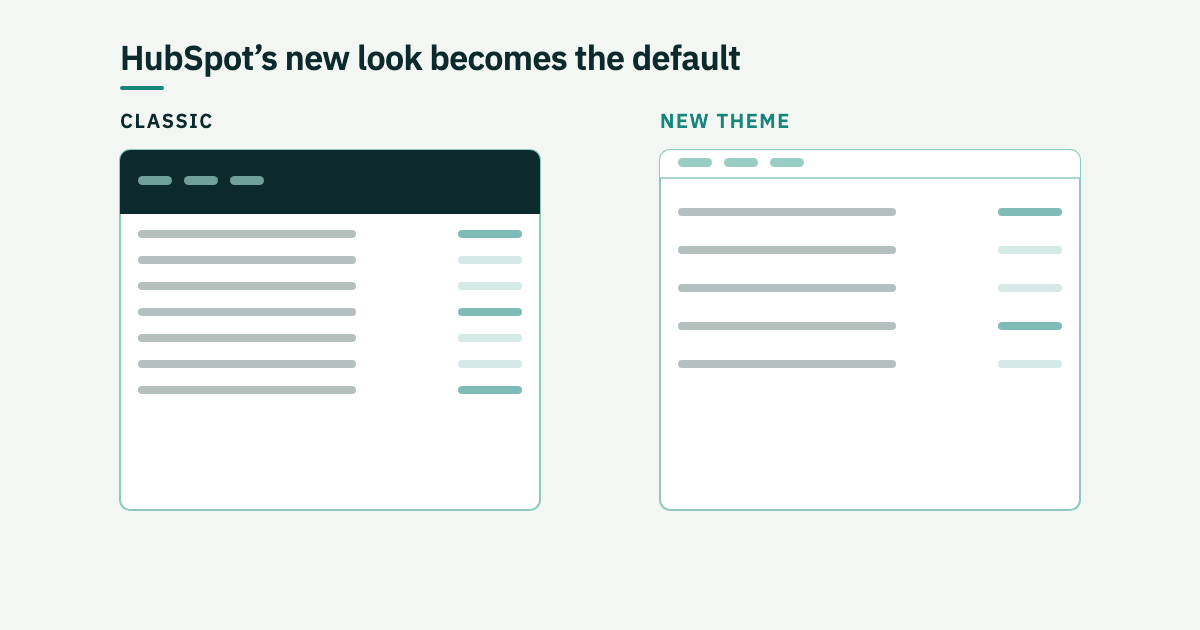
From Monday 31 August the new HubSpot theme stops being optional. If you have not switched, it switches for you.
We have had our own portal and several client portals on it since the public beta opened on 30 June, which is long enough to have a view beyond the screenshots.
What actually changed
Less than the word redesign suggests, and that is the point. Navigation and structure are untouched. Nothing to relearn, no retraining session, no internal email explaining where the settings went.
What changed is weight. The heavy headers are gone, the typography is cleaner, the spacing is more deliberate, and the content on the page is allowed to be the loudest thing on it. HubSpot calls it a lighter feel. Day to day it reads as more room per row and less furniture per screen.
The mobile app follows the same line: a lighter surface, updated cards and iconography, and the unified Breeze and search input arriving on the phone.
Why they bothered
The stated reason is AI. HubSpot's UX lead Mike Holzer put it plainly: when every tool looks and works differently, AI cannot deliver the value it should. A consistent surface is easier for an assistant to sit inside. Accessibility is the other half of it, with WCAG 2.2 AA treated as the baseline rather than a later fix.
The part that matters more
The visual refresh is stage one. Stage two rolls out over roughly six months and is a portal that opens on what needs attention: follow-ups that are overdue, deals that have gone quiet, the next sensible action on a record. Index pages gain metrics and insights alongside the records, so you stop building a report to answer a question you could have read off the list.
Breeze becomes context-aware in the same release. Ask a question while you are on a contact record and it understands the question is about that contact, then drafts the follow-up, logs the note or builds the report without sending you somewhere else.
For marketers the promised shape is one connected view of campaigns, automation, content and performance, with insights pulled from your own CRM data and past results.
What we would do before Monday
Switch deliberately rather than be switched. Doing it on a quiet Friday is better than meeting it on a Monday morning with a campaign going out.
Two practical notes. Any internal documentation with screenshots in it is now wrong, and somebody should own fixing that. And if you have custom-branded email or landing page templates, look at them against the new contrast and spacing before assuming they are fine.
If your portal needs a tidy before any of the stage-two features are worth switching on, that is the work we do. If you would rather talk it through, get in touch.